Layer Blending Modes
This was interesting lesson. Required a lot of experimenting but that is what is so great with Photoshop. Reached into some of the photographs taken the same day as the one of the “Paint Store” in Lesson 3.
Exploring old Cincinnati
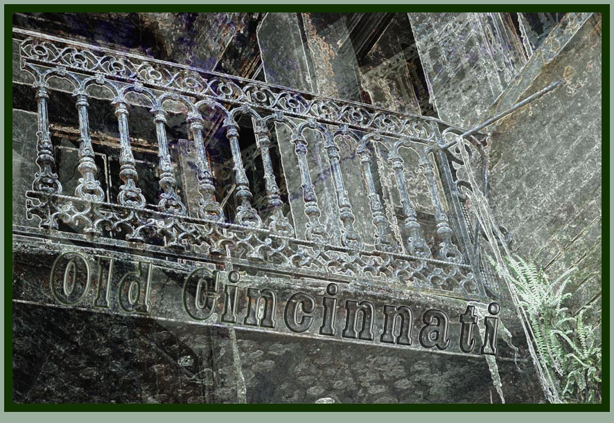
The four photographs that were used in the above.
 The background, oddly out of focus |
 Layer 1, Peeling Painted Brick |
 Layer 2 - Wall & Balcony |
 Layer 3 - Balcony |
The Layer Panel
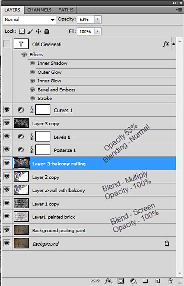
The copied layers were insurance, to try something other than what I had already done. Surprisingly, that which was applied to these additional layers improved the looks but only if I also had the original layers turned on. The copy of layer 2 was simply to make that image darker. But that applied to Layer 3 only gave the appearance seen here with both layers turned on. Without either of the two, it just didn't look right.
Blend Modes — Divide & Subtract
Mouseover for original photograph next two images. First the Blending Mode Subtract
My Shanghai Photographs
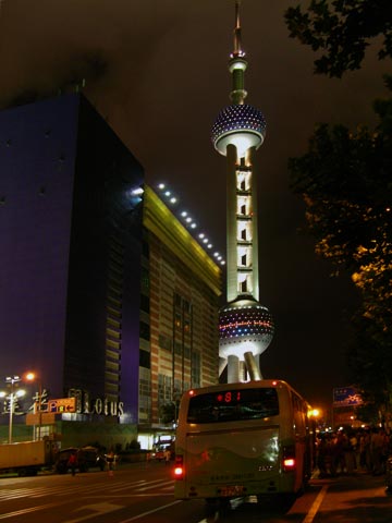
This was within easy walking distance from our hotel, The Shangri-La Pudong, East Shanghai.
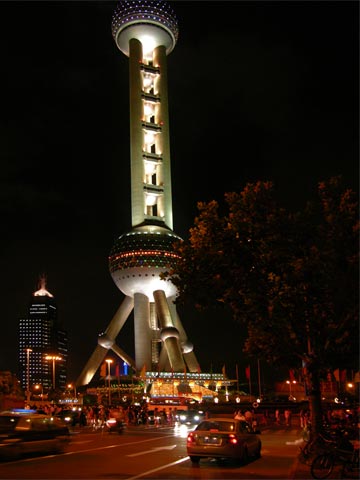
Another of the same tower. I think the overall appearance was improved.
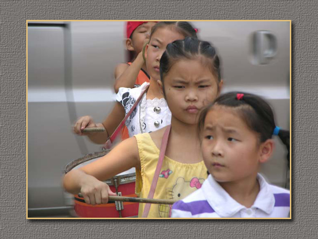
Little Drummer Girl
Blending Mode Divide plus experimenting.
I've now a better understanding of blending modes.
